Implementing OKLCH Color Standard
- Sep 17, 2025
- 4 min read
Issue: Platform has inconsistent color implementation with accent colors that are too bright causing user distraction instead of guiding their attention.
Solution: Utilize OKCLH Color Standard based on human perception of color to improve color consistency by preventing unexpected shifts in lightness, saturation, and hue, which provides controls for brightness and ensures readability through proper contrast ratios.
Developing a UI Color Scheme
UX Audit: Color Palette
I started the project to audit the platform’s UI Color Scheme because I notices some color irregularities during my onboarding period. The aim of the audit was to determine if the irregularities were system-wide or stand-alone issues.
The audit consisted of three areas of focus: visual layout, differentiation, and contrast ratios. I focused on these areas to verify that the visual layouts consistently applied colors, clearly communicated meanings, distinguished between elements, states, and priorities, and passed readability contrast checkers.
The audit identified two primary issues: inconsistent color values across the application, and status colors being too bright causing user distraction. To resolve these issues, I decide to implement the OKLCH color standard to establish a cohesive color palette that considered brightness range levels.
Color Token Format
I continued the project by reviewing our Figma documentation collecting our current color values and inquiring with our Development Team if they had implemented color tokens.
I collected the various color schemes and tokens and mapped them in Figma creating a comparison chart. I grouped the color values by purpose, when possible, but often had to settle for grouping them by release date or color family. After reviewing the comparison chart, I determined that the inconsistencies often arrived during project transition periods when team procedures fluctuated.
To help overcome project fluctuations, I collaborated with dev team to create a Figma Theme Library as well as Dev Implementation Plan providing an easily accessible and understandable color palette guide. The new guide updated the prior color token format to better communicate the purpose and state, which, providing insights into when and where to use the color value.
Prior Color Token
designer, hex values, weight | (designer:#004876:blue:100)
Update Color Semantic Token
category, context, state, color family

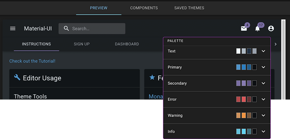
Building a Color Palette
After completing the audit and determining our semantic color token format, I was ready to begin building our color palette. I used a systematic approach to slowly develop the palette by focusing on layout and component arrangement to visualizes color cohesion. I built small color scales: base, lighter, and darker, to compare different layout arrangements to determine an appropriate appearance for the application.
Background and Neutral Colors
Focusing on layout meant starting small and building up a color scheme that focused on cohesion through layers. I determined background and border colors and then moved to selecting neutral gray and blue colors used for navigation and interface elements.
Review an UI Theme builder to identify common color variables
Resource: UI Theme: https://codepen.io/romanshamin/full/WbNxqPp
Select Surface Colors
After establishing the background colors, I moved into examining surface elements to select colors that would appear above background colors. I continued using small color scales to review layout cohesion and contrast. If the visual contrast was too low, I used the OKLCH values to adjust lightness and saturation. Once I had a few color candidates established, I used a contrast checker to ensure color combinations worked together.
Ensure foreground and background colors provide enough contrast for readability
Resource: https://webaim.org/resources/contrastchecker/
Regular body text – a size of 12pt (print), 16px (digital), set as 1 rem
Large text – a size of 18pt (print), 24px (digital), set as 1.5 rem
Determine Functional Colors
A benefit of OKLCH is perceptual uniformity, displaying colors how the eye perceives color gradients. The Atmos tool allowed me to explore and visualize color relationships resulting in a cohesive color palette that communicates specific states and roles.
Use Palette Creator to visualize color cohesion

OKLCH Format
Format (Lightness Chroma Hue / Opacity) = (56% 0.15 249 / 50%) ****
L - Lightness, a value from 0% to 100% that indicates how close the color is to white or black
C - Chroma, a value from 0 to 0.37 that indicates the color's saturation
H - Hue, a value from 0 to 360° that indicates the color's hue angle
a - Opacity, a value from 0 to 1 or 0% to 100% that indicates the color's transparency
Color Scale (100 - 1100)
After establishing my base colors, I used Atmos to build full size scale with OKLCH colors.
Ranging from lightest tint to the darkest shade providing flexibility to differentiation UI elements.
Light shades (100–300) Great for backgrounds and subtle design elements.
Mid-range shades (400 — 700) Used for buttons, text, and other key UI elements.
Dark shades (800–1100) Best for high-contrast text and strong emphasis.
The ability to visually adjust hue assisted with developing color status indications, while the ability to adjust brightness assisted with developing vibrant colors that could be dim preventing user distractions.
Summary
The new UI Color Scheme now utilizes color consistently to convey inherent meaning and guide user attention to act. The project reinforced that Enterprise Software is comprised of charts and dashboards that display vast amounts of information and status conditions. By utilizing OKCLH, I was able to update our UI Color Scheme to present a cohesive look and feel that reduced accessibility problems. The updated color scheme improved accessibility through visual hierarchy that eliminated inconsistent color usage, annoying status indicators, and poor readability conditions.


